The 2026 wedding colour trends you need to know about
- Jan 6
- 3 min read
2026 colour palettes are all about bold statements, whether that’s through a confident minimal white, or through bold hues of blues and greens. With many couples opting for more minimal weddings, less is definitely more. But, if you’re all about colour and want to make a bold statement, then read on for this year’s top wedding colour palettes to inspire your wedding vision.

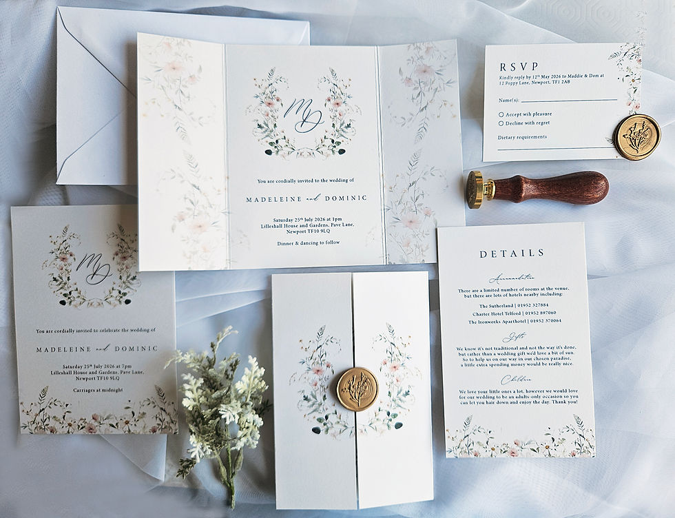
Cloud Dancer
Now, yes this doesn’t bring much colour, but as this is the 2026 pantone colour of the year in the wedding world, I had to give it a mention. Cloud Dancer white is a soft, tranquil off-white that serves as a versatile, serene base for wedding palettes. This tone is all about quiet luxury and brings an opulent confidence to any wedding. This white pairs beautifully with golds, blushes, and neutrals for an ethereal, calm aesthetic, perfect for those who aren’t fond of the bright shades.

Sage & muted greens
Sage is a top contender again for 2026, it’s versatility makes this a popular choice for many couples no matter where you’re tying the knot. As well as sage, you could consider eucalyptus, deep emerald, olive or maybe even a pine green to bring a natural deep hue to your look. Greens can be paired with metallics such as gold or copper, or opt for creams, whites and neutrals for a gentle earthy vibe.
Usually greens are associated with rustic and barn weddings, but used sparingly with the right tone, they can be the perfect base for a luxurious base to enhance your stationery suite.

Dusty, cornflower & powder blues
Blue has always been a popular choice for weddings, think ‘Something borrowed, something blue’. So for traditionalists it’s the perfect way to add blue to your nuptials. However, in recent years blue has become popular because of it’s fresh softness, delicate romantic vibe, and it’s subtlety. Opting for a softer shade prevents the colour from overwhelming your other décor, and instead allows it to sing in harmony with other shades and tints. Taking a soft blue gives you a beautiful base and you can really go to town on your floral displays, table décor and stationery, allowing more creative freedom.
These blues work beautifully with mixed florals, soft pastels, pinks, neutral tones, whites and creams, or even gold and silver if you wanted to add some sparkle.

Peach & Terracotta
Oranges have for a long time been a complete no no with weddings, I think it’s because it can be super bright and very difficult to pair with other colours. There’s also the issue that when it comes to your bridesmaids, orange doesn’t suit everybody.
That said, two popular shades allow the orange hue to be a little more in the background while bringing the understated luxury to your stationery. Opting for a peach tone is going to have a romantic softness, bringing a fresh Spring-like vibe to your suite. In contrast, a terracotta is a much richer shade and will bring a warm, earthy tone, perfect for Autumnal weddings.
The two colours are going to pair well with copper to bring out the orange tint, or opt for lighter parings such as creams, whites, pastels or other earthy tones for an elegant, stylish finish.

Burgundy
Lastly, a surprising top trend of burgundy. I personally love a deep burgundy colour, although it’s rich, it has a velvet, smooth and warm red wine feel to it that just sings luxury, grandeur and passion.
Burgundy will work perfectly for those autumnal or winter weddings, the colour is really going to bring a cosy, warm feel to your décor and stationery, with a passionate romance at its core. With it being a bold colour, if you want your wedding to still say luxury, I would recommend opting for contrasting colours. Many brides and grooms opt for other autumnal shades but it can make your stationery suite very dark and sometimes a little too moody. Or, if you’ve mixed reds, oranges and yellows, it can look a little messy.
I would instead, opt for a delicate cream, ivory or white. This will balance out the colour without overpowering it. If you like metallics, gold would be the best choice, but again, use it sparingly. You want your stationery to be able to breathe and have a delicate elegance about it.
So which is your favourite of this year’s top colour trends?
Whichever you opt for, remember it’s about what speaks to you as a couple, what reflects your personalities? If you’re both bold and loud (amazing!), but maybe consider a bolder hue and not pastels. Whereas if your love is a timeless, elegant romance, then go for a softer palette to showcase this.
If you’re ready to talk all things stationery, book your complementary consultation to get started.


Comments